
A great greeting card blends three things: a message that feels personal, a design that fits the occasion and the recipient, and materials that feel good in the hand. For buyers, especially online, that translates into looking for cards with space for your own words, artwork and color that match the mood, and cardstock and printing that don’t feel flimsy. Whether you’re buying one premium card at a local shop or a bulk pack on marketplaces like DHgate or Etsy, the best cards are the ones people want to keep—because the card supports the message, instead of distracting from it.
What Makes a Greeting Card Feel Truly Great?
A card feels great primarily because it feels like it was chosen for that person, not pulled randomly from a discount bin. Research and category guidance on greeting cards highlight personalization as a leading factor in how meaningful a card feels: tailoring the card to the recipient’s personality, shared memories, or in-jokes markedly improves how it’s received.
That starts with the message. Analysis of card messages by Mojo Greet found that messages which match the occasion and express genuine feelings tend to be more memorable than generic phrases like “Best wishes” or “Thinking of you,” even when the design is similar (Mojo Greet card message study). A short, specific note—”You always make stressful days feel lighter”—beats a long, vague one.
Design matters too. As design educators point out, elements like color palette, illustration style, layout, and typography strongly shape how a greeting card is perceived (The Tech Edvocate on card design). A sympathy card with loud neon colors will feel jarring; a wedding card in soft whites and metallic accents will feel more appropriate. Good design acts like tone of voice: it cues how the message should feel.
Finally, materials and printing affect whether a card feels like a keepsake or disposable. Premium cards commonly use heavier, textured cardstock and higher-quality printing, which buyers often associate with care and value (Wallstreet Greetings on premium cards). The card doesn’t have to be expensive, but it shouldn’t feel like copier paper.
Put together, a great greeting card:
- Matches the recipient and occasion
- Leaves room for your own words (or offers a genuinely fitting preprinted message)
- Uses design elements that support, not clash with, the sentiment
- Feels substantial enough that someone might keep it in a drawer or memory box
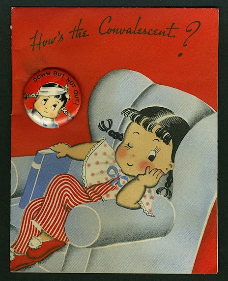
Card Types, Designs, and Materials: Options That Matter When You’re Buying
When you’re scrolling through pages of cards, the choices can look endless. Breaking them down into type, design, and materials makes it easier to filter.
Common Card Types
- Single premium cards: Sold individually, often with detailed artwork, foil, or embossing. Best for milestone birthdays, weddings, anniversaries—times when you want the card itself to feel special.
- Bulk multipacks: Sets of assorted designs (thank-you, blank note cards, holiday). Ideal for offices, teachers, or anyone who sends frequent notes and needs value and versatility.
- Occasion-specific sets: Packs focused on one use—sympathy, holiday, business thank-you. Useful if you know you’ll need multiple cards with a similar tone.
On marketplaces, bulk packs and business-focused cards are common, while hyper-personal single cards may be more prominent on artist-led platforms.
Design Styles and Why They Matter
Guides to card design emphasize four key design elements (The Tech Edvocate):
- Color palette: Bright, saturated colors tend to feel celebratory (birthdays, congratulations). Soft pastels or muted tones feel calmer and work well for sympathy or reflective messages.
- Illustration/graphics: Cartoons and bold graphics suit kids and humorous cards; fine-line florals or minimal shapes suit formal or sentimental occasions.
- Layout: A clear focal point and generous margins make the card feel polished. Overcrowded designs can look cheap and leave less room for text.
- Typography: Pairing fonts thoughtfully matters. A script font can feel elegant; an all-caps block font can feel playful or blunt. Mixing too many fonts is a red flag for amateur design.
When shopping, zoom into the listing photos and ask: Does the art look crisp? Does the text read easily? Does the overall look match the mood I want to send?
Paper, Finish, and Cardstock Explained
Printer and stationery guides stress that paper stock affects both look and feel (StationeryHQ on greeting card paper):
- Weight (often listed as gsm): Heavier cardstock is typically perceived as more premium. Listings may describe “thick card stock” or give a gsm number. You don’t need exact thresholds; just avoid cards that admit they’re thin or “paper-like” if you want a keepsake feel.
- Finish:
- Matte: Soft, non-shiny; easy to write on; suits understated or modern designs.
- Glossy/semi-gloss: Shiny; makes colors pop but can pick up fingerprints and be harder to write on with some pens.
- Textured (linen, cotton, vellum): Feels more tactile and upscale; commonly used in premium cards.
- Recycled: Slightly rougher, more natural look; appeals to eco-conscious buyers.
Stationery specialists note that textured and heavier stocks are often associated with higher perceived quality (Wallstreet Greetings). That doesn’t mean every great card must be thick and textured, but it’s a useful signal when comparing similar listings.
Here’s a quick comparison table you can use while shopping online:
| Card option | Typical feel | Best for | Watch out for |
|---|---|---|---|
| Thin, glossy stock | Shiny, light | Budget bulk packs, kids’ party invites | Glare, smudging, flimsy impression |
| Thick matte cardstock | Solid, smooth | Premium single cards, business notes | Colors may look softer |
| Textured (linen/cotton) | Tactile, upscale | Wedding, sympathy, keepsake cards | Slightly harder to print photos well |
| Recycled kraft-style | Rustic, natural | Eco-friendly, casual thank-yous | Dark inks needed for readability |
Message-Heavy vs. Blank Inside
One practical choice is whether you want a preprinted message, a light prompt, or a blank interior:
- Message-heavy cards work when you’re not confident writing your own note and the printed wording already says what you mean. Mojo Greet’s analysis suggests these are most effective when the message tone closely matches the occasion and relationship.
- Lightly prompted cards (a short phrase plus lots of space) balance guidance with personalization.
- Blank-inside cards are best if you enjoy handwriting longer notes or want to tailor the message for business clients or sensitive occasions.
If you’re buying in bulk for a business, slightly prompted or blank cards are usually safer—you can adjust the tone for different recipients instead of being locked into one phrase.
How to Judge Greeting Card Quality from an Online Listing
Online buyers don’t get to touch the card before buying; you’re relying on photos, descriptions, and reviews across marketplaces like DHgate, Amazon, and Etsy. That makes a focused checklist useful.
1. Read the Interior Description Carefully
Look for:
- Whether the card is blank inside or preprinted, and if the listing shows a photo of the inside.
- The exact wording of any preprinted message. Does it feel generic or specific? Does it match your occasion’s tone (light, serious, formal)?
- How much blank space exists for your note. If you like to write, avoid designs that cram graphics into every corner.
2. Scan Design Details in Photos
Zoom in on:
- Edges and lines: Crisp edges and clean lines suggest better printing; fuzzy text or off-center graphics are quality red flags.
- Color choices: Do colors fit the occasion? A business thank-you set with neon colors may not match your brand.
- Back of the card: Some listings show a logo or small design. A cluttered back can feel less premium in formal settings.
Comparing multiple listings side by side can quickly show which designs are more intentional versus template-like.
3. Check Materials and Printing Claims
Even budget sellers often mention paper details. Look for phrases like:
- “Thick cardstock” or a gsm value
- “Matte finish for easy writing” or “glossy finish for vibrant colors”
- “Textured linen” or “recycled kraft paper”
If materials aren’t mentioned at all, treat that as a sign to dig into reviews or assume the stock is basic. High-end card makers and stationery vendors consistently emphasize paper and printing because buyers associate these with quality (StationeryHQ).
4. Use Reviews for Real-World Signals
For marketplace listings:
- Filter or scroll for reviews mentioning paper thickness, print quality, or colors (“not as vibrant” vs. “exactly like the photo”).
- Pay attention to comments about envelopes if they’re included—thin or see-through envelopes can cheapen an otherwise nice card.
- In bulk packs, see whether buyers felt the assortment worked (too many joke cards, not enough neutral ones, etc.).
Reviews can’t guarantee quality, but they’re often the only tactile feedback you’ll get before ordering.
5. Match Card Type to Your Use Case
Use quick scenarios to decide between cheap bulk and premium singles:
- Birthday for a close friend: One well-designed card on thicker stock, with a mostly blank interior so you can write a personal note.
- Sympathy cards: Softer colors, minimal design, matte or textured stock, and either blank or gently worded interiors. Avoid loud humor sets.
- Business thank-you notes: Simple design, neutral colors, plenty of writing space. Often better as multipacks so your messages look consistent.
If you’re sourcing for repeat use—like a small business ordering through DHgate—you might test a small batch of a bulk design first. Then, once you’ve seen the real paper and print quality, decide whether it’s good enough to represent your brand or whether you need to step up to heavier stock or more tailored designs.
In all cases, remember: you’re not just buying paper. You’re buying a container for a specific message. The listings that help you see and feel that message ahead of time—through clear photos, honest material specs, and detailed reviews—are the ones most likely to deliver a truly great greeting card experience.